Keen to know more
about our Full Service?
Our world class qualitative user testing can help explain the why behind your data and give you the answers to your burning questions.


 28 Oct 2016
 3 minutes read
User Experience design is meant to make a product easier and more intuitive to use, building trust in your website or app. Whilst many examples of great design exist, unfortunately there is a plethora of UX design fails too. What happens when companies implement the poor design concepts which instead lead to UX fails? There are many consequences of poor product design, which you should be aware of when building your brand. Below, are some common graphic design fails and UX design fails, and why they don’t work. Avoid at all costs!
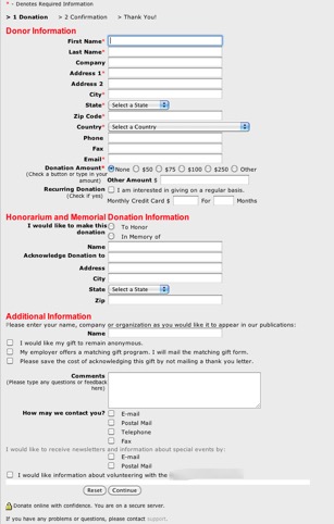
1. Forms that are way too long.
These are especially common if you’re signing up with a service for the first time, or perhaps filling in your shipping and billing information when completing an order. These forms ask for everything AND the kitchen sink. Often they are poorly planned with regard to the business or service they are trying to obtain information for and create unnecessary user interface problems. Keep your forms simple, and users will fill them out!
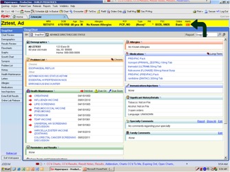
2. Overly complex or text-dominated UI.
This fail is particularly common in larger, slower moving enterprises. Powerful programs have been designed with a cluttered User Interface, leading to confused users, who take more time to do simple tasks. In the example shown below, (part of a particular hospital system), this badly designed UI might have led to the deaths of some patients in emergency situations!
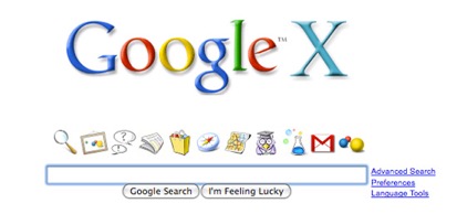
3. Icons that mean nothing.
Icons are meant to replace text and make websites quicker to understand and identify what’s going on. But this doesn’t always work out. Google X (no, not the secretive research lab, but Google’s take on Apple’s OS X interface) launched in 2005 for only one day. These icons weren’t really recognizable and the layout and hierarchy of the other elements don’t really make sense. This perhaps contributed to its immediate demise and the fact that there is barely any information about this product online!
4. Beyond brutal colour schemes.
Who wants to look at a website with 30 different colours that aren’t complementary to each other? Colour scheme is an element of graphic design, but can reduce trust in your users as well as impact navigation, making it an even bigger UX issue.
5. Bad performance means no performance.
Nearly all of your users will leave your site if it doesn’t load on time, (and it’s goodbye if something doesn’t load at all!). Performance that is glitchy will reduce trust, especially if you take your customer’s sensitive information like in an e-commerce business.
6. Carousels aren’t fun anymore!
Please, no more carousels. Countless studies have shown that these popular elements cause confusion for users. Users almost never focus on what’s in a carousel and rarely interact with them (and it’s almost never useful for them!) If you need more convincing, should-I-use-a-carousel.com might help you..! Or just picture the nightmare carousel below anytime you have the urge to use one on your website..!

Remember, these ideas are only still around because people have grown accustomed to them. It’s time to buck the trends!
Recognize some of these design fails in your own products? Think you may have fallen victim to a poor design process? TestMate’s custom user testing packages with help you identify where your users are experiencing problems, in order to help improve conversion rates and increase customer satisfaction!

Our world class qualitative user testing can help explain the why behind your data and give you the answers to your burning questions.