Keen to know more
about our Full Service?
Our world class qualitative user testing can help explain the why behind your data and give you the answers to your burning questions.


 01 Apr 2020
 4 minutes read
The checkout is the bottom line of any e-commerce business model. It’s the culmination of all your product development, design, and marketing, and a bottleneck where customers take the final step to convert into a sale. Ultimately, checking out is the last step before conversion, so it’s critical to make the experience as seamless as possible.
This is where it gets tricky. It’s hard to know what exactly constitutes a seamless checkout experience and it doesn’t help that there are endless variations on the online checkout. From simple single pagers to multipage side scrollers, accordion layouts, to a million other possible quirks, features and add-ons to consider as well.
To make this all a bit easier, we set out to identify the best practices for e-commerce checkout design and boiled them down into a simple list of 8 Dos and Don’ts. Findings were drawn from testing conducted on 13 major Australian and International e-commerce websites. We asked participants to carry out a product purchase and compared written feedback as well as performance on two proven UX satisfaction metrics: the Net Promoter Score and the System Usability Scale.
DO
Simple Design:
 Keep it simple. While it seems obvious, many checkouts are visually overcomplicated. Once a customer has reached the checkout they don’t need to be wooed anymore by aesthetics. Your job is to help them complete their purchase with as little effort as possible. High performing checkouts always contained larger amounts of white space and implemented concise and scannable content.
In-checkout Navigation:
Users responded positively to checkouts with clear navigation that allowed them to return to earlier stages of the process with ease. People don’t like to feel trapped. Always give users the option to return to adjust their order, and never make them have to start all over again. Your user is choosing to buy your product, so how they check out should feel like their choice as well. Use a checkout with a step by step layout and always include a quantity adjustment tool.
One Page Checkouts:
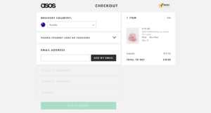
Different checkouts can be used for different purposes, so by no means is this a hard and fast rule. However, in our research the highest performing checkouts employed a one-page, accordion style. This style of checkout ticks the box for our first two points, allowing for a simple design that is easy to navigate around. It also minimises the need for scrolling, which was a big source of complaint from Mobile users.
Maximise Perceived Speed:

There are two kinds of time when you’re online. There’s the actual time, which is the objective amount of seconds it takes to do something like buying a new hat. Then there’s the perceived time, or how long it FELT to buy the hat. Research shows that the feeling of speed is much more important to user satisfaction than simple loading time. And giving users the illusion of speed is much cheaper and easier to improve. Using loading bars, loading content above the fold first, and preloading important content first are all ways to instill a perception of speed.
DON’T
Sneaky Additional Costs:
Users respond negatively to the exclusion of additional fees in cost displays. Be upfront with all costs and charges as early in the checkout process as possible. Dropping a +$15 administration fee at the final stage of the checkout is a sure-fire way to infuriate your customers, harm your credibility, and could lead to cart abandonment
No Unavailable Stock Alerts:
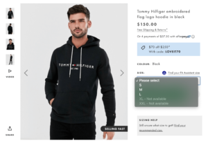 If a product is out of stock then slap a big red OUT OF STOCK on it or don’t make it visible at all.Nothing harms customer UX like getting to the end of a purchase only to be told that they won’t be receiving their product.
Forced Login:
Users responded negatively to forced login in the middle of the checkout process, and most prefer not to have to login at all. We’re aware that customer login is important and sometimes internally mandated, but if possible, having a guest checkout option will always go down well with customers. Forced logins should not be preventing you from converting sales.
Overuse Promotional Content:
 Just like going overboard with a checkout’s visual design, having a ton of promotional content on the screen AFTER the customer has already made a purchase is a big no-no. Users responded negatively to the overuse of promotional content or being shown item recommendations after they had finished shopping.
Conclusion
These best practices are a great guideline to start with as a blueprint for your site’s checkout design. But at the end of the day, your checkout will be a reflection of your business, and the only way to get design feedback that’s relevant to you is through usability testing. Reach out to Testmate to find out more about how usability testing for your website can improve shopping cart conversions.

Our world class qualitative user testing can help explain the why behind your data and give you the answers to your burning questions.