Keen to know more
about our Full Service?
Our world class qualitative user testing can help explain the why behind your data and give you the answers to your burning questions.


 19 Apr 2022
 5 minutes read
In the work we do at TestMate, a key focus is observing how users interact with websites and apps. The information gleaned from user testing helps steer decisions on both initial website/app designs, and also subsequent iterations of those designs. The ultimate goal is for users to achieve their aims as quickly and painlessly as possible.
User testing is obviously not the first step in this process. It is part and parcel of a web designer’s job (before making design suggestions or plans) to consider the user experience and imagine, sometimes even presume, what the user will do.
But can we predict user behaviour?
How we can predict what a user will do
Of course, it’s impossible to know what a user will do next. This is why we conduct user usability testing. If we could predict user behaviour with complete accuracy, we wouldn’t need user testing at all. But there are some UX principles that can give us a good idea of what will and won’t work in terms of usability. These guiding principles are a starting point when designing a new website/app, and also give us direction when fixing websites/apps that are failing in some area.
What are the principles that help us predict user behaviour?
We’re going to outline a few tried and tested principles that can be relied upon to enhance user usability. These UX design principles are based upon typical user behaviour, and whilst we can never be certain a user will behave in a certain way, these principles eliminate a lot of guesswork, and get us more quickly to a place where our website provides a successful experience for the user.
There are many UX design principles, so this list is by no means exhaustive. These are simply the principles we think are most important.
The Principle of Least Effort
None of us want to do more than necessary when it comes to looking up a service or making a purchase online. We’re generally time poor, so if a website or app requires too much effort, frustration sets in and we give up. This may be us giving up on getting a service we need, or giving up on a purchase we were attempting.
Here, the Principle of Least Effort can help us predict a user’s behaviour.
Users want to follow the path of least resistance. This means that if a website/app is convoluted, we can pretty accurately predict the user will quit. Predicting how long it takes them to quit a site is harder, but if the customer experience is too difficult, you can be reasonably sure that the user will bow out at some stage. Some may return when they have more time. Some will forget to return. And some will choose another service/product provider with a simpler customer journey.
Think of when you buy something online. There’s always a part of you that’s ready to change your mind. If there are too many steps involved to purchase the item you want, you’re asked too many questions that aren’t relevant, the payment method you prefer is not available, or something in the process is not functioning, then you have plenty or time to reconsider your purchase, and not go ahead.
The principle of least effort provides solid ground for any UX designer. At every stage of the process, a designer should think about incorporating ways to reduce:
They should also consider ways to make things easier on the user. Some ways to do this are:
The Principle of Perpetual Habit
People have been using the internet to access products and services for a long time now, and are accustomed to seeing information presented in familiar structures.
Tried and true formats make it easier for users to find the information they need.
Examples are:

 A standard example of the familiar F pattern is a menu at the top of the page, a second menu on the left-hand side, and product images to the right. (We know this format so well, it barely seems like a deliberate design choice.)
You can safely predict that, based on perpetual habit, a user will find it more time-consuming and difficult to find information if you deviate from standard web formats and place information in less predictable places.
This is not to say you can’t be creative as a designer, but you need to carefully weigh up what looks good with what serves the user. Sometimes, there’s a nice in-between.
(Notes on the hamburger menu: whilst it’s a familiar tool users can rely on and it’s worth including on a web page, there’s suggestion you should be wary of storing important information only there. A user won’t necessarily click on the hamburger menu, so if there’s information you want to champion, place it on the page, rather than hiding it away in a menu. See more about the pros and cons of the hamburger menu here.)
The Isolation Effect
If we have a collection of items on display, we can predict a user will notice and remember the one item that stands out as different from the others. This ability to predict is based on the Isolation Effect, or the Von Restorff Effect (coined by German psychiatrist, Hedwig von Restorff).
In relation to UX design, we can take advantage of this effect by determining what the most important items are on a page, and adjusting design to make those items stand out from elements around them.
An example is highlighting a CTA button in a distinct colour and separating it from surrounding elements with white space. This makes it clear to users that they should click on it.
Another example of using the Isolation Effect is adding something like a ‘Best seller’ or ‘Most Popular’ banner to an item on a page. This not only makes the product or service stand out, but it also says to the customer that they don’t have to think as much— the thinking has been done already, and people have chosen that item.
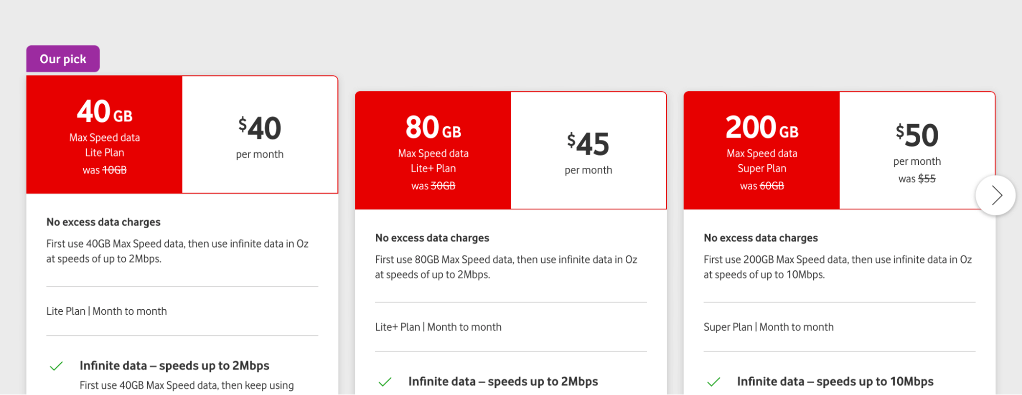
Here’s an example. On this Vodafone page, they’ve added an ‘Our pick’ banner to the product they want to promote, and have situated the content a little higher up the page than the other options, so it stands out. We could safely predict that a user would read this option before reading the others.
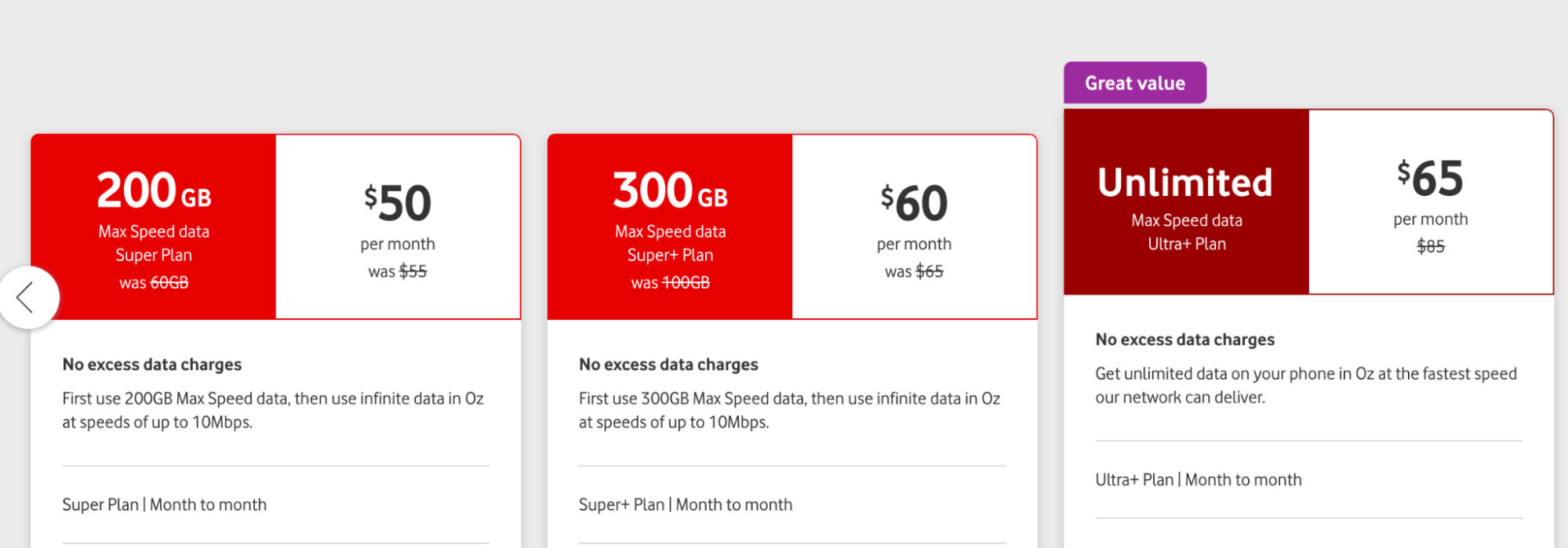
This other example from Vodafone does the same, with a ‘Great value’ banner. It also changes the colour of the item from red to maroon, to make it stand out from the rest.
This Aldi page uses a similar technique. The red banners saying ‘Now with more data’ draw the eye to the two centre products.

The Isolation Effect is an easy tool to use when designing product pages. The only risk is overusing it. If you try to make too many elements stand out, none of them will. An example is having many different CTA buttons on one page. The user may not know which CTA you most want them to select. So, use the Isolation Effect sparingly.
The Principle of Cognitive Load
We can predict that if we require too much thinking from a user, we may lose them along the journey. This comes down to cognitive load.
With attention spans ever-diminishing and so much competing content online, users have little mental space for your website or app. If you overload them, they may disappear.
You may also see them disappear if:
So, what do you do if you have thousands of products or service options you want to include in your page, and you don’t want to lose your customer?
Here are some ways to include your entire offering, without overloading your user.
Eliminate the appearance of choice.
Obviously your customer has many choices, but it’s a wise idea to reduce the number of choices in any given section.
Featuring between 3 to 4 products across a page gives your user the space to absorb the images.
If you squeeze more products in, it’s:
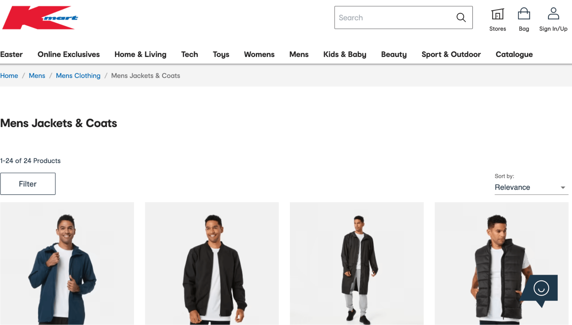
Here’s a standard example of a website with thousands of products (Kmart), limiting their offering to four products across a page. If the user wants to see more, they can scroll, or use the search menus to locate the products they need. Reducing the options in this section allows for more white space. There is more time and space for the viewer to actually absorb the images, and think about the product.
Use chunking
One way to reduce options on a page is by chunking. This means, placing products or services into logical categories.
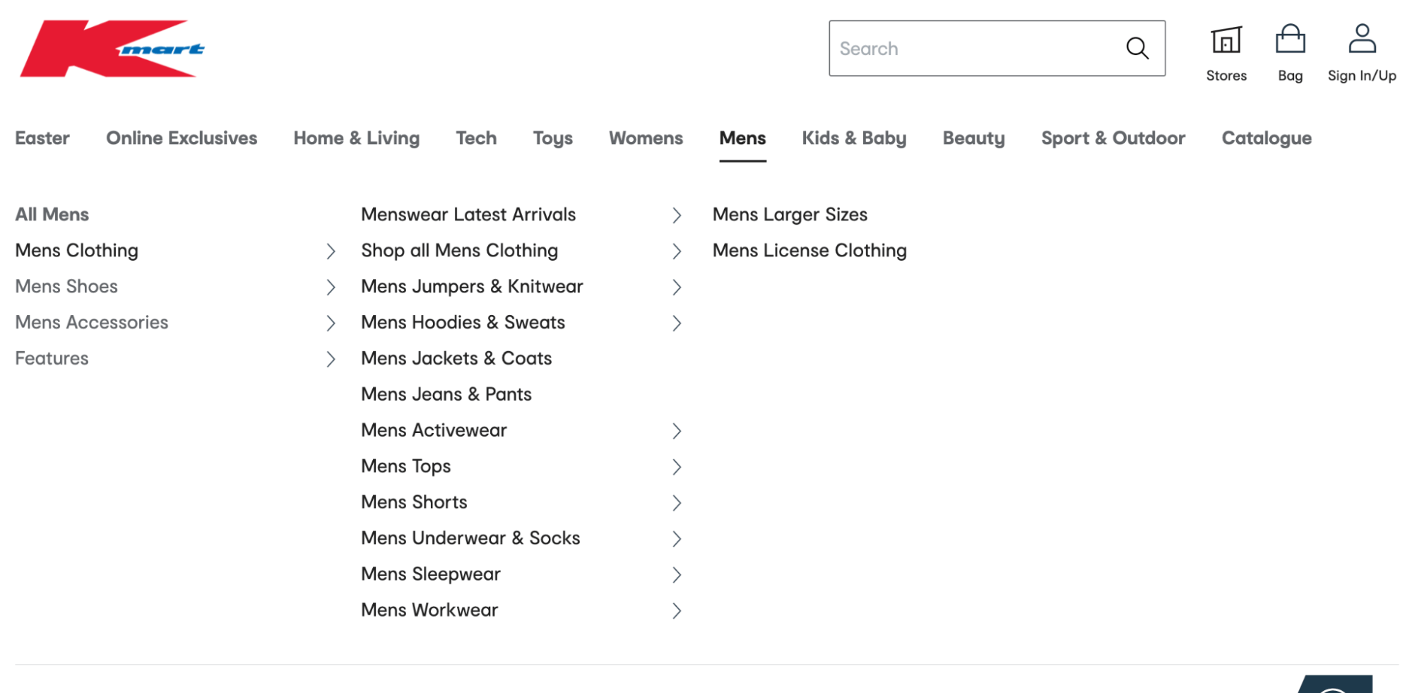
In the example below, rather than a user searching for men’s clothing and seeing every item of men’s clothing available, clothing types are categorised and the user can select the category relevant to them.
They can also apply filters to further hone in on what they need. These options prevent them from being overwhelmed by choice.
Many of the streaming services also use categorisation to ease choice overload for viewers. By grouping genres of TV shows, and suggesting programs based on what a viewer has previously watched, they save the user a lot of time scrolling through every choice available to find what they need. See this example from Netflix.

Again, chunking/categorising is so ubiquitous, it doesn’t seem like a deliberate design choice. But there is method to it, and there are many websites and apps out there that fail to categorise at all, or place things in categories that don’t make sense, and the user never finds what they need.
Use progressive disclosure
Swamping users with too much information in one hit is always a bad idea, and again, overloads their brains.
To prevent this, it’s a good idea to use progressive disclosure.
For example, if a user needs to complete a form, you may break that form up into sections (within reason), so that the appearance of all content on one screen doesn’t overwhelm them. This is particularly pertinent for mobile users, who are using small screens and can’t scroll through an entire form easily.
Here are some tips on successfully using progressive disclosure.
To be continued…
We’re going to leave it there for now, but we’d like to talk more about how we might predict user behaviour using other UX design principles. Stay tuned for our upcoming blogs!
TestMate User Testing
Maybe you’ve made a prediction or two about how users might respond to your website or app? Do you want to put those predictions to the test and see how users actually interact? If so, get in touch with TestMate.

Our world class qualitative user testing can help explain the why behind your data and give you the answers to your burning questions.


